Everyone likes clean laundry and a clean website design.
The cleaner your website design, the easier it will be to load (pun intended). A clean layout, along with using the correct format of photos and font sizing is crucial for a well-constructed website. Customers and mobile users will both appreciate a website that is easy to use and navigate. Fast loads and a strategic “call to action” will improve the success of your website. Easy to read fonts (san serifs) in legible colors on appropriate backgrounds are crucial for the reader to comprehend your message. Using Google or standard fonts in the build of your site will help browsers recognize your text, which will return better search results.
Secondary Pages
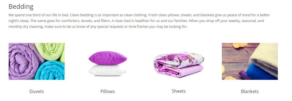
Clicking on the page “Household” takes you to the next page where you can learn more about household items a visitor may consider to have dry cleaned. On the subsequent pages, we create harmony by using color-coordinated photos. Fresh colors of bedding give a clean look to the page and suggestions of what visitors might want to have cleaned.
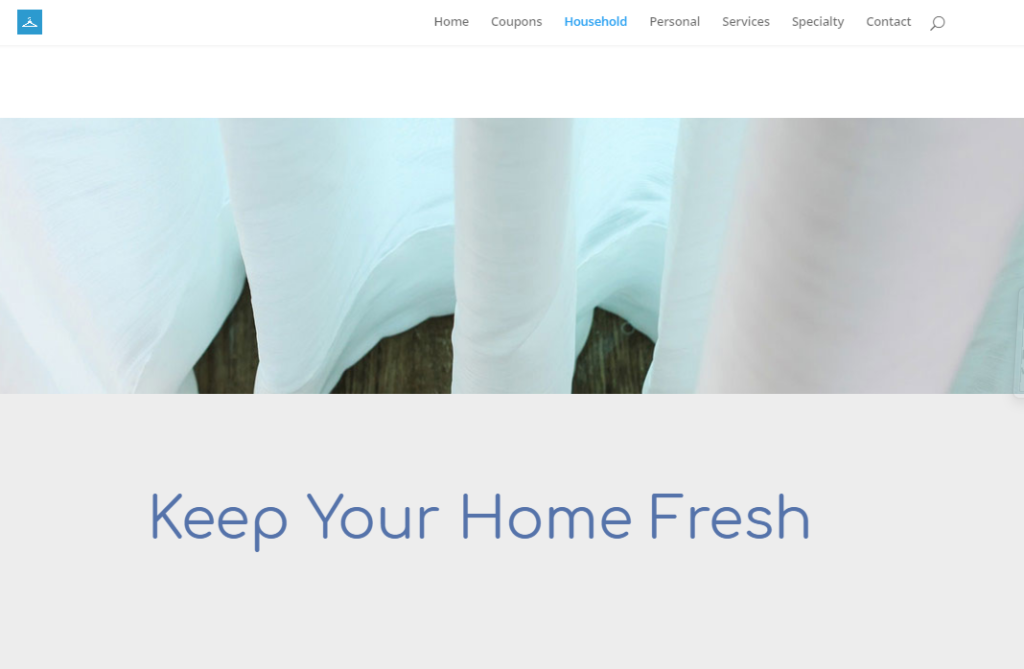
At the bottom of the page, we added a parallax effect which brings a touch of movement to the page. A wide photo of iridescent sheer draperies adds color and flow. To see our squeaky clean website in-person visit www.procleandrycleaners.com
![]()
Pro-Clean Dry Cleaners in Brookfield recently contacted WurkHub to create a clean start with a new website design. Their previous website went down which brought the opportunity to bring them up to date. For small businesses, sometimes a simple website such as this one is all that is needed. However, the same principles apply of clean and functional design with clear navigation.
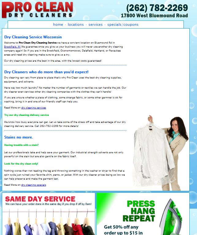
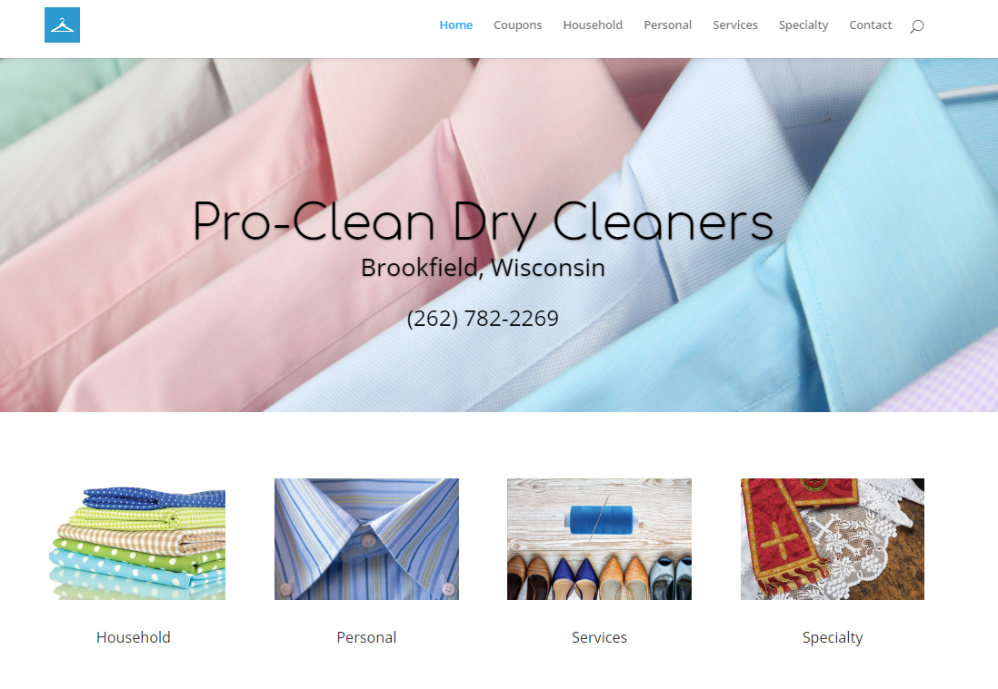
Here is a before and after of the site Pro-Clean Dry Cleaners. On the old site, we see too much text and few visuals until you reach the bottom of the page. The old website is narrow, has a dated look and not mobile friendly. Looking at the new website, it is very clear that you have arrived at a dry cleaner’s site. The new site is full width and mobile friendly. People are visual, and by using photos as wayfinding, it will help them quickly find what they are looking for. The layout and organization of a site are important. Rather than place everything on a Home Page, it is best to create separate pages with categories. We are able to accomplish this by using the top menu directory as well as the 4 photos below the header. The client name and city is prominently displayed with a clickable phone number so that contacting the business is the first call to action. Check out our website page for more examples.
