Brookfield Acupuncture Rebranding Project
Professional vs Mystical
The Task:
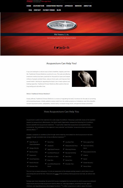
Take an existing brand to the next level for a more professional image. Brookfield Acupuncture was known as “The Acupuncturist” which sounds more like a superhero than a profession. The client was looking to appeal to other health professionals such as doctors and physical therapists, and to clients as a resource for whole body health and “alignment”.


Rebuilding the brand appeal and the website.
The existing color red and acupuncture needles are not the best combinations. This tends to lead the audience’s attention that red equals pain and blood. Blue or green is a more appropriate use, which is calmer, cooler and soothing.
Rather than show back pain, the better choice was to show relief and a positive full range of motion. WurkHub added clear call-to-action to give the audience choices of what to do or where to go for more information.
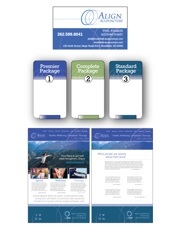
There is a slight tip of the hat toward an acupuncture needle in the logo, subtle but present. A circular motion was added in the footers and headers to further impress on the visitor freedom of movement when interacting with the brand.
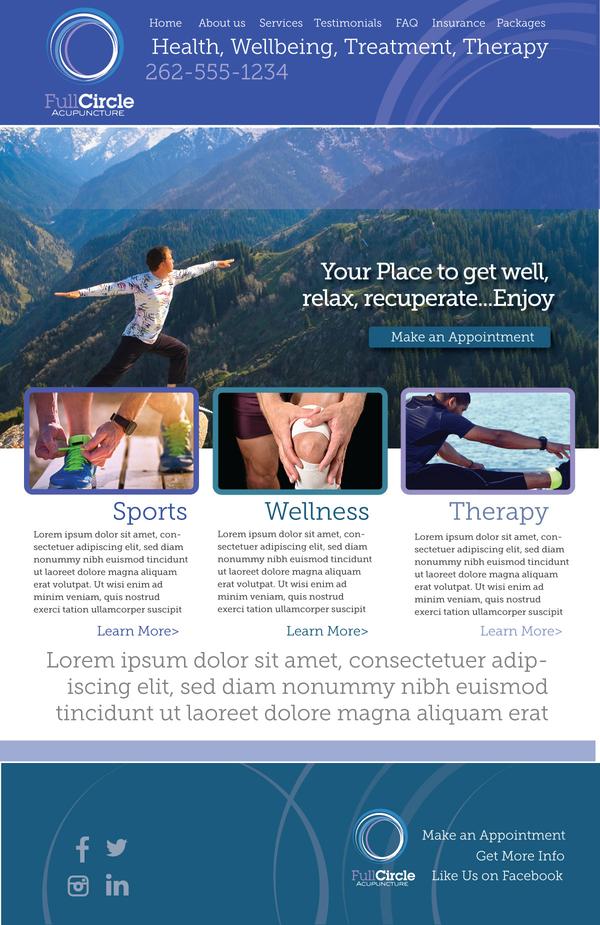
The finished project can be found here … Align Acupuncture
Printed Materials and Packages.
As with most clients, our intention is to carry the new brand throughout the company’s marketing materials. Below is the layout for business cards, a brochure, and informational handouts.
 Brookfield Acupuncture
WurkHub Rebranding Case Studies

Sign Up For A Newsletter


Sign Up For A Newsletter